Introduction
The second level for the ROCH series resumes from where we were left previously, on route to a warehouse by elevator that provides access into another district of town. Here Pascal decides to considerably tone down level scale, instead creating a more focused playing field that continues ROCH1’s earlier attempts at experimenting with ideas that may or may not work out for future levels to come.
Review
I believe ROCH2 manages to achieve two very opposing qualities from the lessons learnt during its predecessor. Visual appeal and architectural clarity is much improved upon by shifting closer to and favouring realism for its source of inspiration whilst designing the city. This decision however leans too heavy toward realism that in turn negatively affects gameplay once Duke sets foot indoors. Where ROCH1 relished its openness and chaotic gameplay, the sequel enjoys restricting player movement. Interior spaces become a tight squeeze, lowering the quality of these combat encounters found within by reducing available options against these opponents. The close quarter nature does have potential at becoming deadlier engagements but not exactly riveting to play in practise, boiling down to simplistic slug fests as to who can weave in and out of a doorway better. Regarding Duke3D’s enemy AI, that will typically always be in the player’s advantage no doubt. Of course, even Commanders will find themselves in these limited spaces similar to their previous utility and their threat factor is all dependant on how they behave; Choose to shoot a fast rocket and they’ll deal some pain, as even splash damage will do the job. Should they choose to move around though, getting stuck somewhere for easy pickings is often the end result.
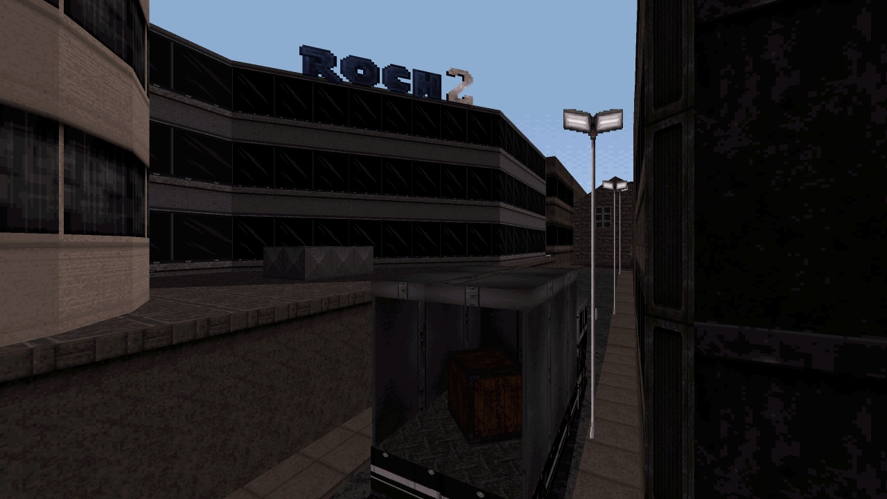
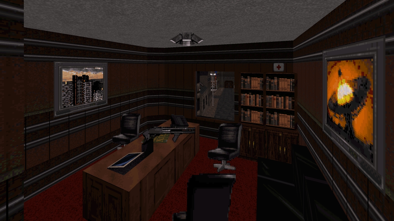
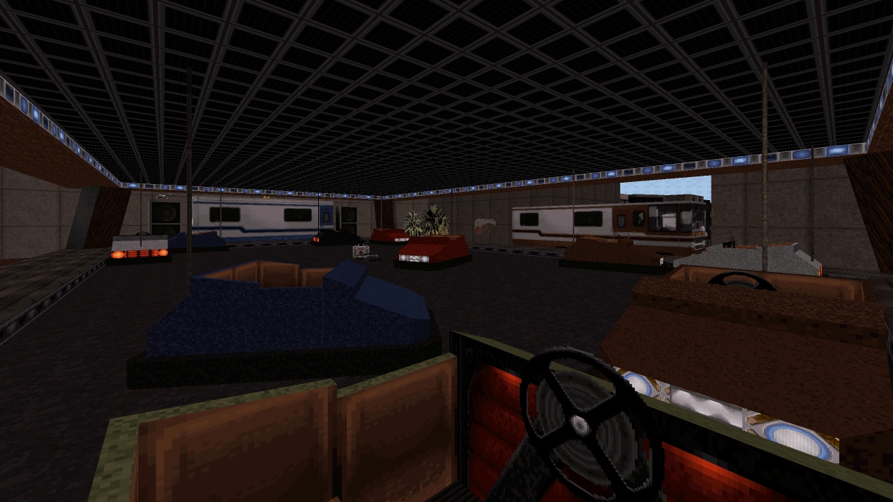
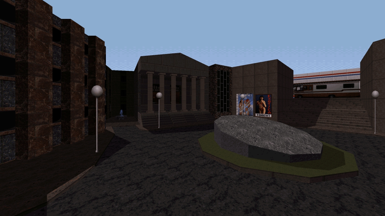
Outdoor encounters are otherwise unaffected by the issues that plague those indoors, following similar principles that have already been defined during its previous instalment by utilising many types of aliens to confront players. Enemies take whatever advantage they can take from the space available to them in an attempt to put players on the back foot, by taking up positions on rooftops as ground forces close in, hiding around corners to catch an unguarded flank or patiently lurking inside shops should anyone retreat into them. Another scenario I enjoy is right after leaving the warehouse at the beginning by providing a few options. I can dive back from where I came from, take a right turn into a dark alleyway and confront two Enforcers before they join the frenzy or make use of a parked truck as a constant source of cover. It’s one of the better first impressions to starting a level, especially from a visual perspective. Those high contrast shadows during daytime increase an atmosphere that sells the idea this district will mostly be backstreet themed. ROCH2 might be a physically smaller level, yet it still remains just as densely packed with many places to visit and secrets to unearth, from a doctor’s clinic to mankind’s deadliest bumper cars. Pascal already shows more confident mapping in the short time between releases, ensuring more consistency across indoor and outdoor visuals. Interiors may be cramped but they won’t feel empty, containing enough décor and furnishings along with unique room shapes to represent their intended locations. I do like while exploring each one of these buildings, windows will open to reveal the streets below providing respite from the claustrophobia as if letting in some much needed fresh air for a stuffy room.
Conclusion
ROCH2 is a dense level that improves on its visual design by showing more confidence and consistency, leaning much closer to realism at the cost of unremarkable combat encounters when exploring interiors due to their tight spaces hindering movement for both player and enemies alike. Outdoor scenarios are otherwise more enjoyable, improving on what worked from its predecessor.
Download Mirrors
Part of a Series
This is a re-review. The old review has been archived here.


