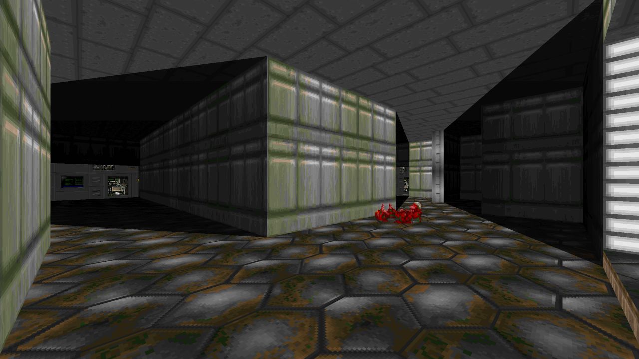
Introduction
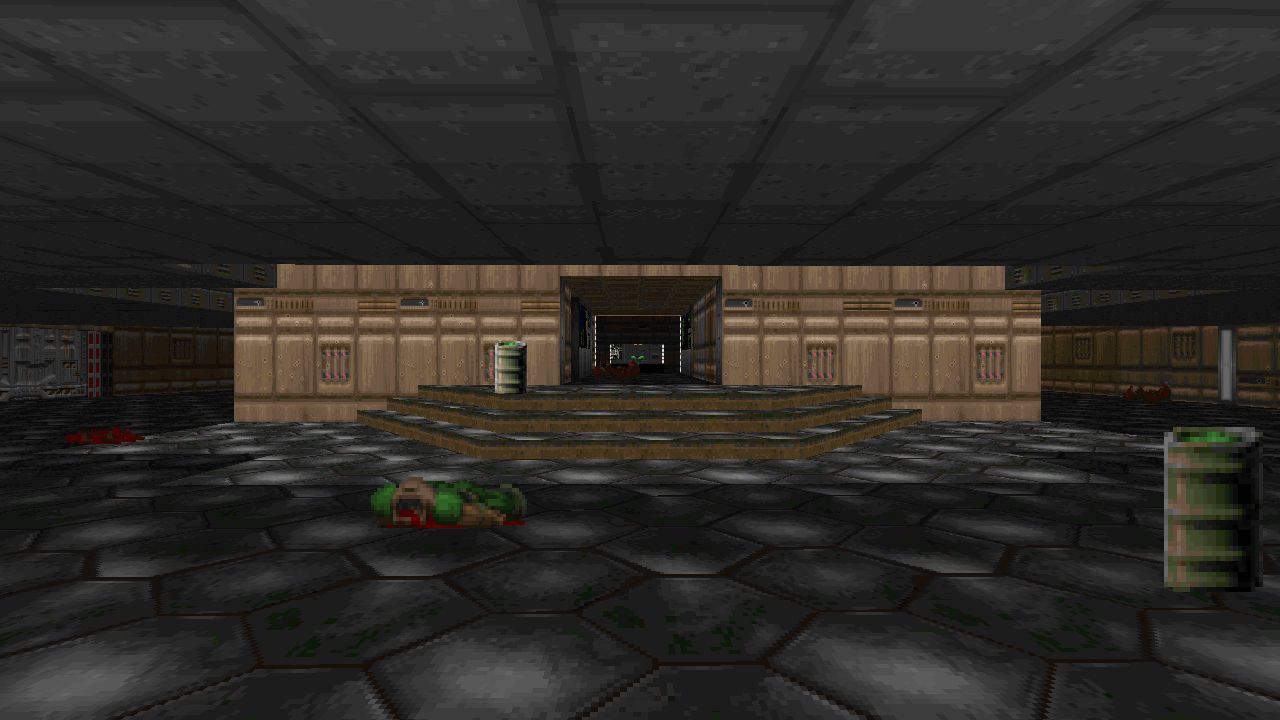
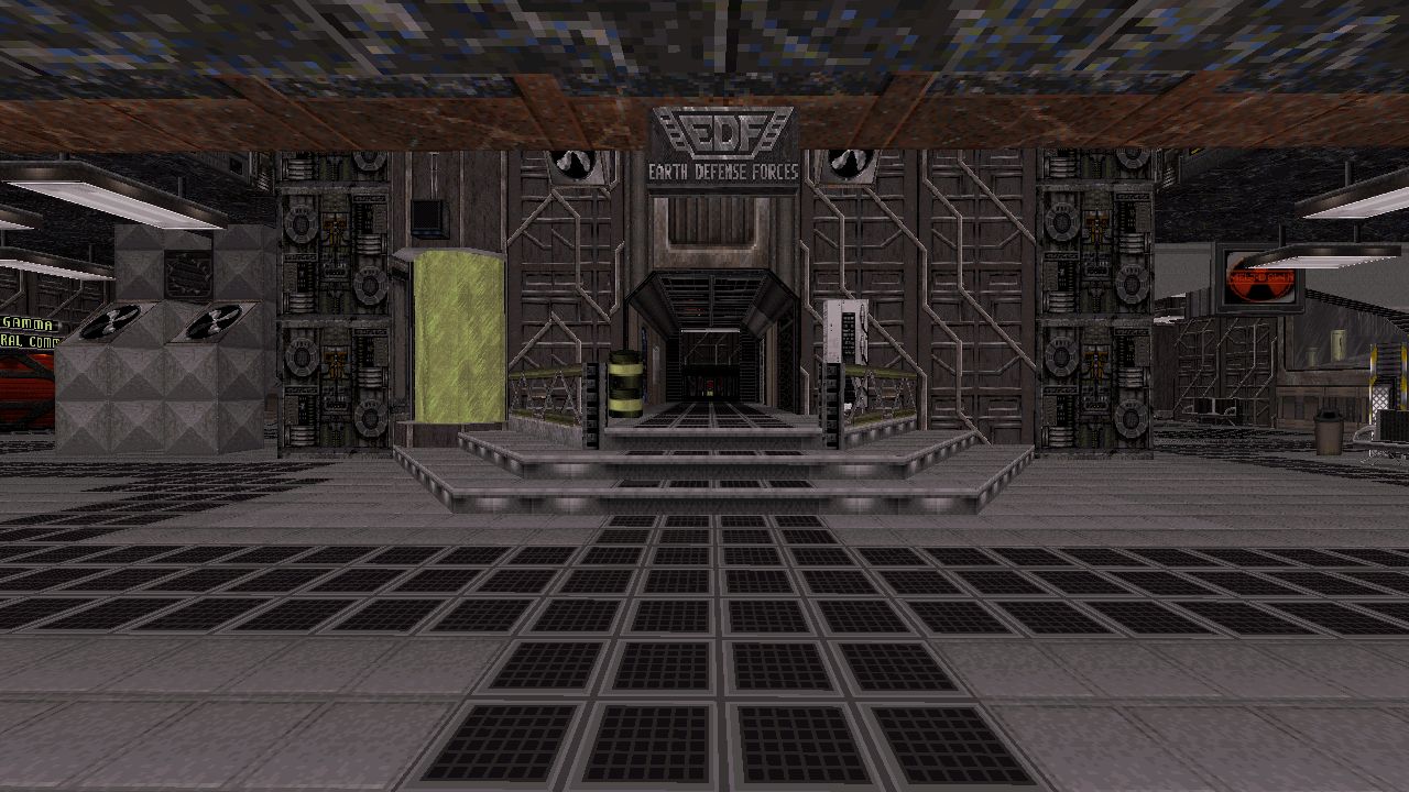
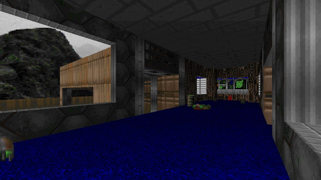
DOOM remakes for E1M1 or MAP01 are a dime a dozen over the years and recreated for various engines, while other classic levels are often left behind without receiving similar homages. Step into E1M2 through the eyes of Duke Nukem, taking on that familiar layout from the original painting a fresh layer reimagining how Nuclear Plant might look in the year 2024.
Review
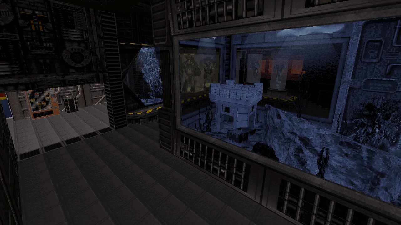
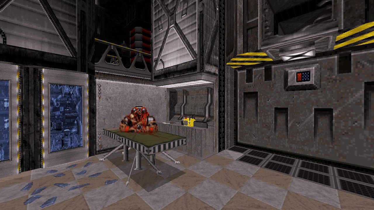
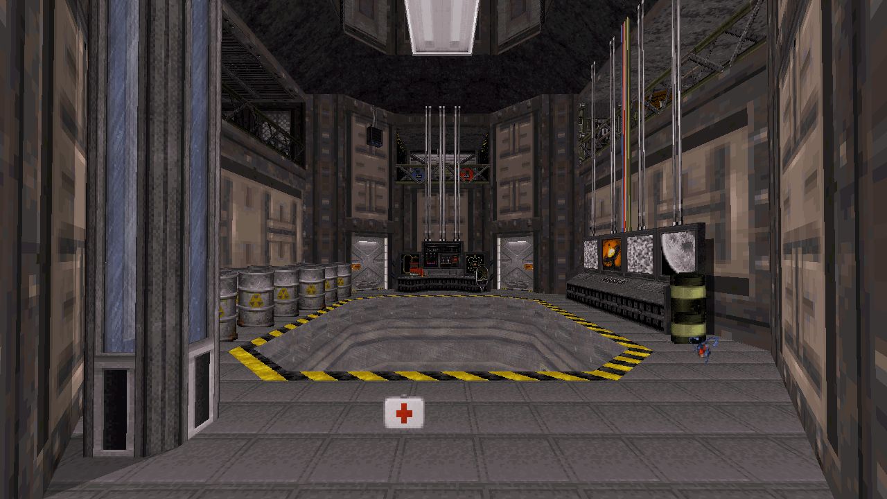
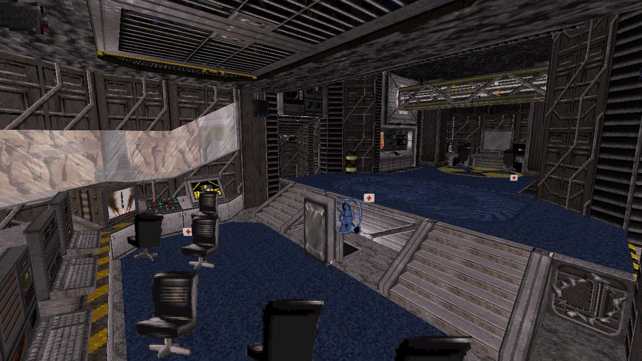
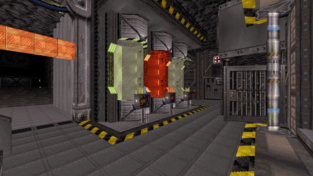
I’ve seen a fair share of remakes that typically settle on copying what already exists and bringing nothing new to the table. NP2024 however steps beyond those constraints to instead redefine the original theme and layout to become a functioning EDF Mars facility where people could have worked jobs, at least before aliens invaded of course. I quite like the abstraction of DOOM’s locations not concerning themselves with realism, utilising organic shapes and layouts to avoid them from becoming too predictable and stale. However that’s not to say realistic takes on these levels aren’t a welcome change of pace to witness a familiar setting through this alternative lens and StarNukem sprints ahead utilising this style. There’s a considerable amount of attention given to decorating each area to keep you busy just looking at everything within sight from seating or computer furnishings and even right down to wiring and plumbing setups visible through grating. Thought has been put behind these additions and their placement so rooms now serve a specific function and any objects now occupying these once empty spaces exist with purpose. It’s easy to miss details the first time, chock full of smaller items make this place feel lived in such as an ashtray on a desk with a smoking cigar left behind. Other pieces that stood out for me include a massive Devastator canon situated outside on a distant rock, paying a Duke flavoured homage to DOOM Eternal. I also adore those computer screen mash-ups depicting a game being played distracting employees from their boring day jobs.
Expansions to make sections wider or taller have been made to not only fit these additions but to accommodate other features like unreachable scenery like upper walkways or active conveyor lines behind glass panes. This also extends to how the level flows, while following general broad strokes of E1M2, isn’t entirely confined to a similar progression with new paths and optional ventures to pursue. Without exploring beyond the main path there’s a risk being stuck using a pistol and shotgun for a large chunk of playtime, assuming you don’t luck out from an Enforcer dropping their weapon. Those familiar with the original level should have an easier time discovering these secrets here as they remain mostly intact, yet sadly during my initial run I forgot how to gain access outside and was without a chaingun the entire time causing the simple combat romp to become a little repetitive. With a good arsenal on hand though the action is constant but doesn’t break the usual mold, primarily guarding their designated zones waiting to be dispatched and then moved on. Smaller detours to normal gameplay is what makes up for this however, I quite enjoyed using a crane to fish up some extra supplies early on. There’s also a nasty little gotcha moment attached around the nukage pools chewing through boot durability, yet an RPG is found by taking a risk swimming through these containers. Five super secret switches have also been hidden around the facility throwing in another layer to exploration. I couldn’t find all of these which boils down to a personal pet peeve of mine regarding hiding switches in otherwise visually cluttered maps that cause strain on my eyes during a focused search, particular with Duke3D’s textures being so busy at smaller scales, so in the end chose not to obsess too much and moved on to avoid any headaches.
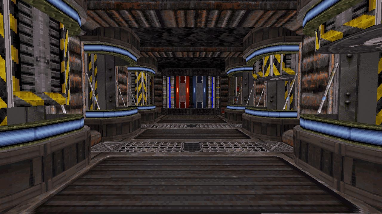
On one hand it’s charming to get absorbed into the design and see what feats are pulled off using only default assets to achieve a certain aesthetic, picking apart at texture and sprite selections to represent real world equivalent objects otherwise not available amongst the set, at times wondering what I’d have done differently to achieve a similar outcome. However with these highly varied texture schemes and tightly packed decorative elements, it runs a risk at having too much visual noise, especially concerning areas that are too well lit or lack some plainer contrasts to break up design. There needs to be a degree of clarity for important aspects to stand out when needed. Despite having praised the individual elements of design across NP2024, there is too much vying for your attention all at once that it also distracts from the overall picture. The starting zone is a good example of all these extra additions along side a monotonous colour scheme and flat, bright shading ends up blurring everything together. Yet this becomes less of a problem around places like the vat tube portion where lighting is more varied, darkness framing these scenes allowing the lit up tubes and tanks to stand out as important features here. Even rooms with tall ceilings occasionally have their upper reaches obscured with a gradient shadow as to not be overabundant when it’s not necessary. The capability to achieve this look is definitely there, but not quite as consistent as it could be by spreading detailed elements out a little more and simplifying the secondary components.
Comparison Screenshots
Conclusion
Sometimes I’m not particularly excited about yet another DOOM level remake having seen so many of them over the years, but quick to change my tone if they’re done well. NP2024 does exactly that with it’s iteration, while a little on the busier side from a design point of view, it’s still a richly decorated level that converts a classic into a suitably Duke flavoured romp. The action is simple but functional, exploration feels rewarding and dense for its smaller size and includes a secret switch hunt perfect for replayability.
