Introduction
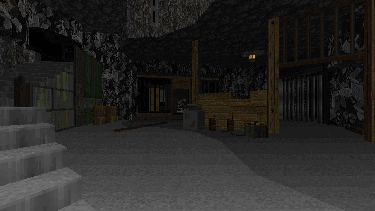
Communications have gone dark and there’s been no response from the outpost, you’re heading there to find out what the situation is. Emerging from the cavern you can see the base up ahead, some of the lights are still on but it’s quiet. Too quiet. Snowmobiles have been abandoned a short distance away from the outpost as flares fizzle in the snow. Nearby, a motionless body. What happened here?
Review
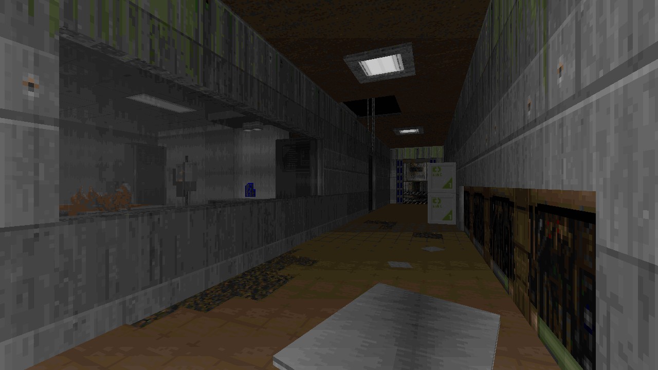
During some of the development time for this map I’ve provided help in the form of answering editor related questions and giving feedback after testing prior versions, so it remains difficult to be entirely impartial while reviewing this piece of work without making that disclaimer. Where my thoughts come from however are based around those initial impressions and following improvements up until release day. While I’ve always found Duke3D having a versatile texture set allows mappers to get a lot of mileage out of the existing assets, DOOM’s on the other hand is more restrictive by comparison, which makes it all the more fascinating when a similar degree of creativity can be squeezed out of those pixels to represent aspects they were never designed for. This hasn’t been the first time to achieve results like this in DOOM, but OUTPOST13 presents a fine showcase throughout it’s design, putting an emphasis on a smaller scale and detailing real world objects, typically referred to as “DoomCute” within the community.
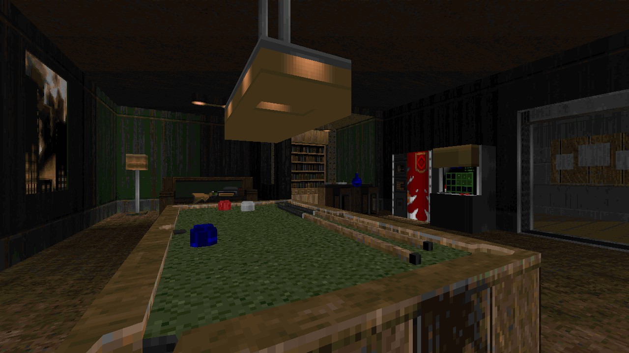
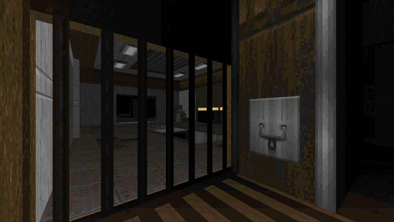
Taking influence from John Carpenter’s, The Thing (1982), Brullov reimagines how the Antarctica outpost could look inside the DOOM engine, ensuring many of the iconic areas and scenes can be discovered while exploring these halls, such as the kennels or excavation site. It’s the type of level that you simply want to stop every five seconds to admire and examine the techniques pulled off to create specific objects and furnishings. Texture work is simply immaculate, presenting a worn research base that otherwise feels homely in places. I also appreciate how different textures are assigned to doors that can be operated normally and which require switches. Both the recreational and communication rooms are some of my favourite areas, as all those extra embellishments that help to complete a scene are here from the little stubbed out cigarettes lying in an ashtray or a little microphone besides the radio equipment. Many similar additions find their way into suitable spaces from coffee mugs and lamps, to paper pinned up on cork notice boards and fire extinguishers. I particularly enjoy how dense the initial outdoor area is, framing itself like a haunted mansion on the walk up to the base and some instances of environmental storytelling. Special attention is given to shadows casting off from various objects, helping define a distinctly dark atmosphere here. I always love seeing vehicles constructed in either the BUILD or DOOM engines, and this level doesn’t disappoint, the helicopter found up on the ridge is of special note that’s immediately recognisable from a distance.
Not all decorative elements are static either aiming to benefit players via interactive opportunities, which are tied into finding bonus items and secret places, such as opening lockers for a tiny boost to supplies. Combat then tends to feel secondary to exploration and visuals, leaning into the moodier side by being slower paced. OUTPOST13 is mostly tame by keeping the enemy numbers low, prone to ambushing you rather than making head on collisions. The largest fights are often resorted outside the base once an important milestone has been crossed off the list, while indoor clashes don’t have much teeth to them to keep the pressure off while chewing on the scenery. Dealing with the two Barons around the pool table had a few close calls but mainly due to the furniture interfering with your current elevation while avoiding attacks. Anything more hectic than this just wouldn’t work within the cramped environment. Archviles otherwise get the shorter end of the stick by not having much opportunity to work within their role before being easily dispatched. They merely pose as a potential hazard if ignored but never get to become one, either failing to exit their room properly to raise dead allies or being thrown onto the frontlines with rockets heading their way. Even the concluding battle remains consistent with this tone, being more of a spectacle than offering a challenge. Just be prepared to throw those headphones off before firing that last shot.
Conclusion
Exploring the outpost is like a walking through a museum full of curious trinkets, chilling out to moodier vibes and slow paced combat helps break up otherwise action heavy levels. The lack of difficult fights is not an issue considering the tone, but some extra bite on UV would have been desirable. OUTPOST13 is a gorgeous looking map soaking in a dark atmosphere, utilising excellent use of DOOM’s default textures for its many decorative embellishments.


