Introduction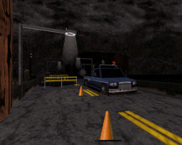
This is a new map released in town that even makes Mikko call it “the most detailed Duke3D map as of today”. Below is tweaked translation from the text file.
The teleporter used to return to land lost its resonance frequency and the antimatter was absorbed by an electric storm, apparently caused by a rare mineral that was found inside a coke mine. This none other allows the teleportation in large quantities, which generates a magnetic field capable of changing the polarity of the electric current in a radius of 5 to 10 km, and because of their qualities they are operated by the hydroelectric company in the area where this was found. Duke’s problem is that communications are totally interrupted by the release of such mineral of a violet capsule that was accidentally destroyed. You must venture into the mine to locate the core of the ore and destroy it while avoiding more invasive aliens.
Gameplay
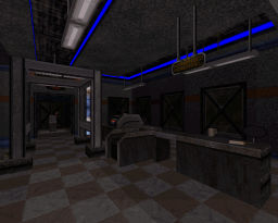
Pretty much your standard Duke map with its solid and enjoyable gameplay, though lacking a little on the health item side of things, unless it was intended to have your brains scattered across the room by a pigcop hiding behind his little counter. Of course nothing fustrating since the task at hand isn’t too difficult, except getting caught in the tight rooms though. Not too much of a problem however when you’ll probably be spending most of your time gazing at the level of detail in awe, while a trooper desides to pelt you with lasers. The level itself is short and is mostly a keycard hunt like most maps, but the flow is fairly decent, nothing much to complain about either.
Design
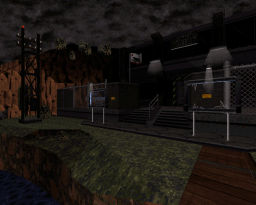
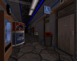
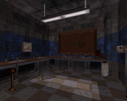
What happens to a map where the level of detail rivals even that of Bob and Pascal, taking that little extra step in creating real world looking objects? Possibly a large mess and mash where you find yourself tripping over the details, or just a plain over ambitious mapper? Well, that doesn’t seem to be the case here when it comes to this new map which is definitely designed well, no doubt. Everything is pretty much detailed enough to look like a real world object while not over complicating things and adding too much colour. Plenty of spritework, a majority of which is made to have a three dimensional look to it. The vehicles, vending machines and even powerlines are really well made, especially the train giving the map a fresh feeling for something new in the eye candy aspect. The level’s main structure is also decent, although rather tight, they’re just as well designed including the exterior locations, great lighting effects and good texture choices. Everything flows fairly well together, except those invisable walls which tend to break the immersion.
Conclusion
All round a solid map to play that offers some brilliant design and spritework, though a little lacking on the health side of things and a tight squeeze in some areas.
Overall Rating: 90%
Type: Singleplayer
Authors: Luciano “Gambini” Gallo
Download: MSDN / DNR
Hey Quakis, links are outdated and therefore DNR´s one is broken. See ya!
Hi there Quakis. Have you noticed the images are no longer available? I plan to link this great review to some portfolio in which im working on. Do you think it´s worth reuploading them?