 Authors: Various
Released: November 22nd 2011
Download: Here
Introduction
Halloweenville was a competition organised by Planetphillip, JustMakeGames and TheHappyCloud, which challenged mappers to create a scary scene and five entries were submitted.
All Hallow’s Isle by Botolf
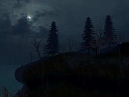
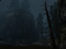
The scene is set on a small island in the middle of some ocean, having been washed ashore and not having any recollection where you are. While the general concept may work for a horror themed scenario, the execution here could have been better. To put it bluntly, the level is lacking in several areas. There are no well defined paths, or some form of layout to know exactly where you should move to and from, especially when you wish to reach the upper sections yet most of the cliff walls are steep and the actual route is obscured. The narrative to convey goals for the player could have been improved upon as well, in one case with a second bottle just suddenly coming into play while also quite tricky to locate its placement. All Hallow’s Isle relies too much on darkness to create atmosphere, only causing some of the problems previously mentioned, shrouding the majority of the map and hiding everything within a near black veil. The biggest disappointment is the abrupt ending which feels like it was just thrown in there just to conclude things. Even by showing this instead of some text on the screen could have easily been a slight improvement.
Asylum by Greenman
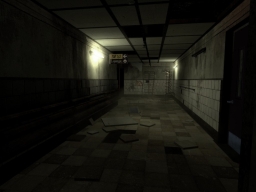
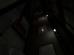
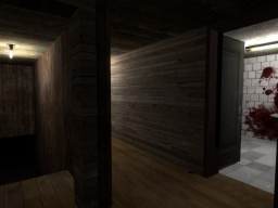
Entry number two is an asylum themed level, a classic choice in terms of horror, with a gritty design through it choice of textures and some nice lighting to match, leaning on this location for a subtle hint of atmosphere. However, I felt there was a lack of definition of an actual asylum besides from the morgue, missing some elements and locations to bring that feeling across, only to instead consist of corridors, a few rooms which don’t say a great deal and a long elevator shaft where most of the experience will take place. In ways, this map would have probably been suited for a vertical contest since it has a nice climbing sequence to reach the upper floors. The short playtime was a shame and unfortunately, Asylum also has another one of those anticlimactic endings. This is where more places to explore would have worked well, like several rooms for patients with visual cues which might tell a story, or perhaps some staff areas for theirs as well, which could have established an explorative based narrative approach for gameplay.
Note: If objects appear too bright and shiny, type buildcubemaps into the console.
Cabin Fever by Leslie Aerts
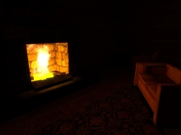
This looks like another entry which relied too much on darkness, instead only to create some tedious gameplay forcing the player to shuffle in the dark or carry around some weak light source just to navigate well. This honestly didn’t make exploring the cabin very fun to do. Not that there was much to see however, only to serve as a means to hide this fact, the design is definitely on the bland side with flat geometry and minimal amount of detail by using a small amount of furniture props here and there. As for the rest of the level, ignoring the issue presented by the lack of lighting, there were a few nice ideas to make the cabin almost feel as if you may not be truly alone and creates a much more eventful location. It just felt on the dull side to play however, mainly because of the issues already presented, dragging the rest down as an immersion killer more than anything. With some work to both of these aspects, as well as some polishing up and a clearer direction would greatly improve things. Hopefully any future releases by this mapper will get better from here.
Dark Bad by Alex Haddow-Mendes
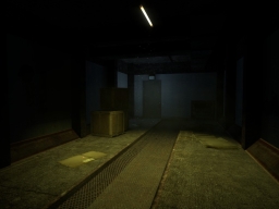
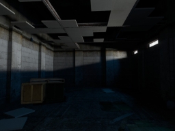
I couldn’t quite tell exactly where this was supposed to take place and whether or not that was intentional, but I assumed it was some kind of industrial building. Leaving aside the deciphering of the location for now, the core theme here is the feeling of being followed, where you will want to watch your back at all times because someone out there is coming. And they want your blood. While this, like most entries, has an excessive dose of darkness in various places, it uses this effectively to create some interesting lighting effects and angles, helping the horror elements rather than hiding them. This works considerably well for the idea, yet some more exploitation of this light and shadow could have gone a long way. Other ideas also rely on how the player reacts to certain scenarios, including the messages written on walls. I didn’t like the unexpected deaths in one corridor, not conveying the situation very well here concerning the NPC and what must be done. The overall concept of this map is good, but could have been approached better for a more polished experience, but a good effort to stand out nonetheless.
Missing Person by Justin
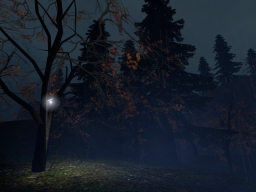
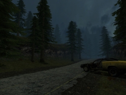
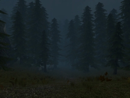
The longest entry by far out of the five maps which consists of three parts, mainly taking place in a dense woodland valley and generally has a good sense of location during gameplay. This pretty much has it all, from an introductory start, several horror aspects in the middle and rounded off with an ending. Two of them in fact, depending on how the player deals with a certain event. I’m sure not many people would like to get lost inside of a forest, which is conveyed here very well as part of the theme. The player would be seeking out for any sign of civilisation after an accident, only to get deeper and deeper into the foliage and instead coming across all kinds of bizarre activity. Pretty much a good display of effects using the default assets, but tends to focus on jump scares through some of these. The design all round is solid with good terrain work and the density of the woodlands feel right on the mark while also allowing plenty of space to roam through. Fog adds a considerable amount to both the visuals and atmosphere, getting thicker the closer to evil you are. One stark contrast is the lighting compared to other entries, being mostly bright and goes to show that darkness isn’t a sure success to make things creepy, unless used well.
Conclusion
Perhaps too many maps rely on darkness for its scares, but the pack might have something for everyone to enjoy. Missing Person is my favourite for the overall effort and experience, while Dark Bad made use of an interesting concept and could possibly be polished up and turned into something bigger.
Download Mirrors
Planetphillip
