 Author: Ashkandi
Released: October 30th 2007
Download: Here
Introduction
Assume the role of a mental patient trapped inside of an asylum, wishing to find a means of escape from this nightmarish place. The building holds many secrets, but the primary goal that you seek is not to hang about for the horrors that await and the mindless bloodbath in your path, but to survive and get through this in one piece.
Review
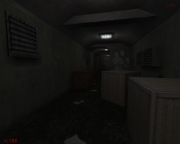
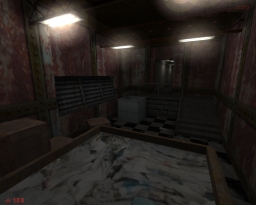
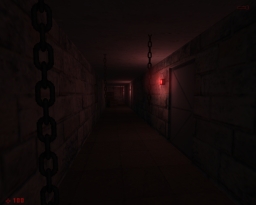
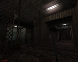
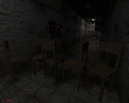
There appears to be some amount of influence taken from the Silent Hill series for the horror themes, or at the very least, using a similar kind of mood as found in the first game through its visual style. Mistake isn’t a lengthy mod by any means, nor is there much to the gameplay for one to get involved with. Instead, the experience focuses on creating atmosphere and the build up of tension while the player explores their surroundings and keeping on their toes from what may or may not be lurking nearby. In some cases, it does a decent job at doing so, always giving me this bad feeling that something could pop out at any moment and give chase, causing my progress onwards to be slow. This was probably a good thing considering how short each map section is, one of them only lasting a couple of seconds.
The key setting takes place primarily inside of an asylum, having the player explore both the patient floors and into the basement areas. The asylum isn’t clean and sterile either, approaching the theme instead with a gritty and rustic appearance in each location, doing well not to overdo this too much at one time. Some places do feel somewhat natural to appear like this though, such as the laundry chute room. The architecture doesn’t exactly strive too far from square rooms and corridors, using mostly furniture, ventilation and a bit of shape in the ceiling as a means of detail. At other times, there were a few scene set pieces to include some mystery into the plot, concerning the events that may have taken place at the asylum or the state of our character’s psyche, from the dead bodies hanging from the ceiling, to these grotesque looking creatures roaming the halls. Lighting is generally on the moderate side, not relying too much on darkness for scares, which allows the exploration aspects to be enjoyable as a result. There were however a bit too many bright flashing lights for my taste. On a minor note, a little more trim work would have done well here and there, such as between doorways.
Conclusion
Focuses mostly on creating atmosphere, the build up of tension and exploration inside of a rustic looking asylum. Not too much involved in gameplay, but fans of Silent Hill and similar styles of horror and environments may enjoy this.
Download Mirrors
Moddb
