Introduction
Like a love letter to QUAKE2 and named after an unofficial expansion pack, ZAERO takes all of its influences from the base game and designs a three level unit around ZDOOM features. Despite being labelled the first episode, two decades have gone by at the timing of writing and a sequel still hadn’t surfaced and therefore took interest revisiting one of the earliest wads I ever played to see how well it holds up.
Review
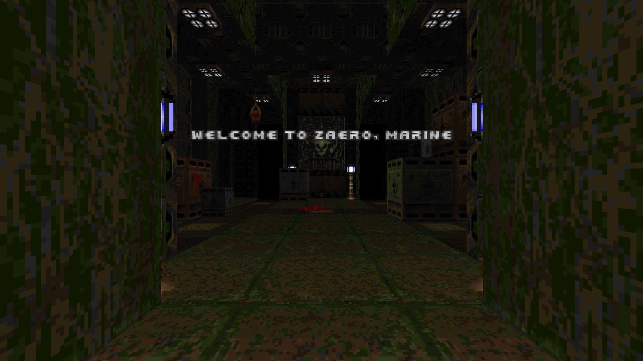
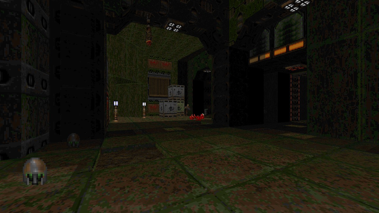
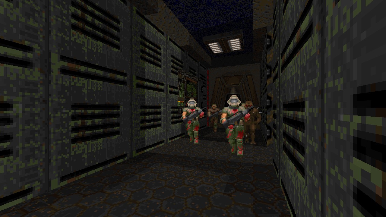
While the experience remains DOOM at it’s core, ZAERO doesn’t shy away from wearing QUAKE2 like a glove by taking several visual and auditory aspects and then emulating them within a different engine. The entire campaign takes place within metallic facilities akin to the Strogg grunge aesthetics, using a dominantly green and brown palette. Sound replacements such as picking up items and opening doors alongside select music from the Sonic Mayhem soundtrack further revel at being authentic to its influences. As a ZDOOM specific project, Searle keeps a tight lease on the utilisation of these features, aiming for them to enhance what already exists. Sloped surfaces were a part of Strogg base design and is thus taken advantage of here as a decorative element and occasionally used as a path to raised platforms. Particle effects are placed around electronics accompanied with electrical spark sounds to cut the silence and make a deteriorating environment more apparent. Translucent windows and security cameras also serve to get sneak peaks into upcoming zones and feel suitable for the setting, none of the port specific features felt tacked on for little reason. Onscreen text used for dialogue and custom messages in ZDOOM releases do however get me worried they’ll be forced and unskippable, but their application in ZAERO is kept tame and to a minimal. There were a few odd moments with our character reacting to the most basic ambushes exclaiming “Oh Shit!” where their inclusion adds nothing, but those serving to aid in navigation were practical. Messages declaring “Access Denied” or “Opened Elsewhere” can save you from wasting time finding a local solution or expecting a secret that isn’t here. Brief exchanges from your superior also keep your current objective in focus, I’d expect there to have been more cases of interaction during later units but those here didn’t offer much beyond what normal progression already has you achieve.
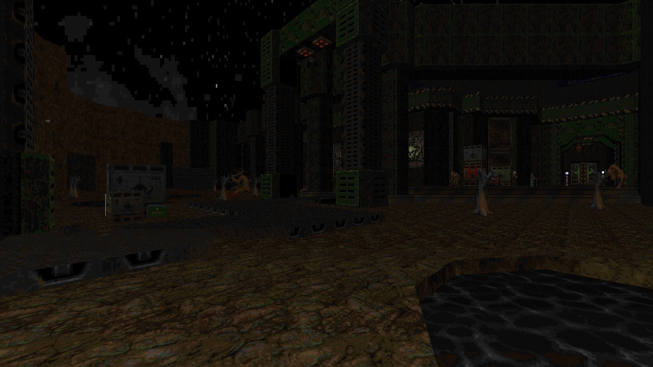
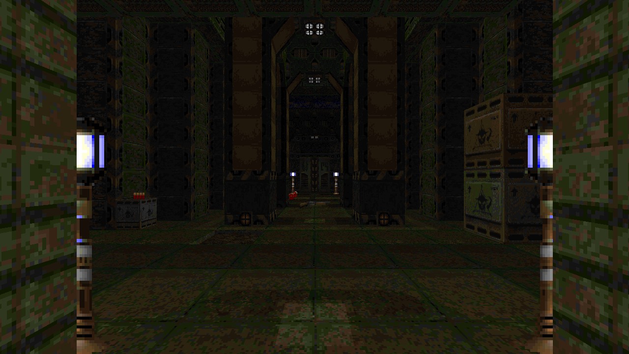
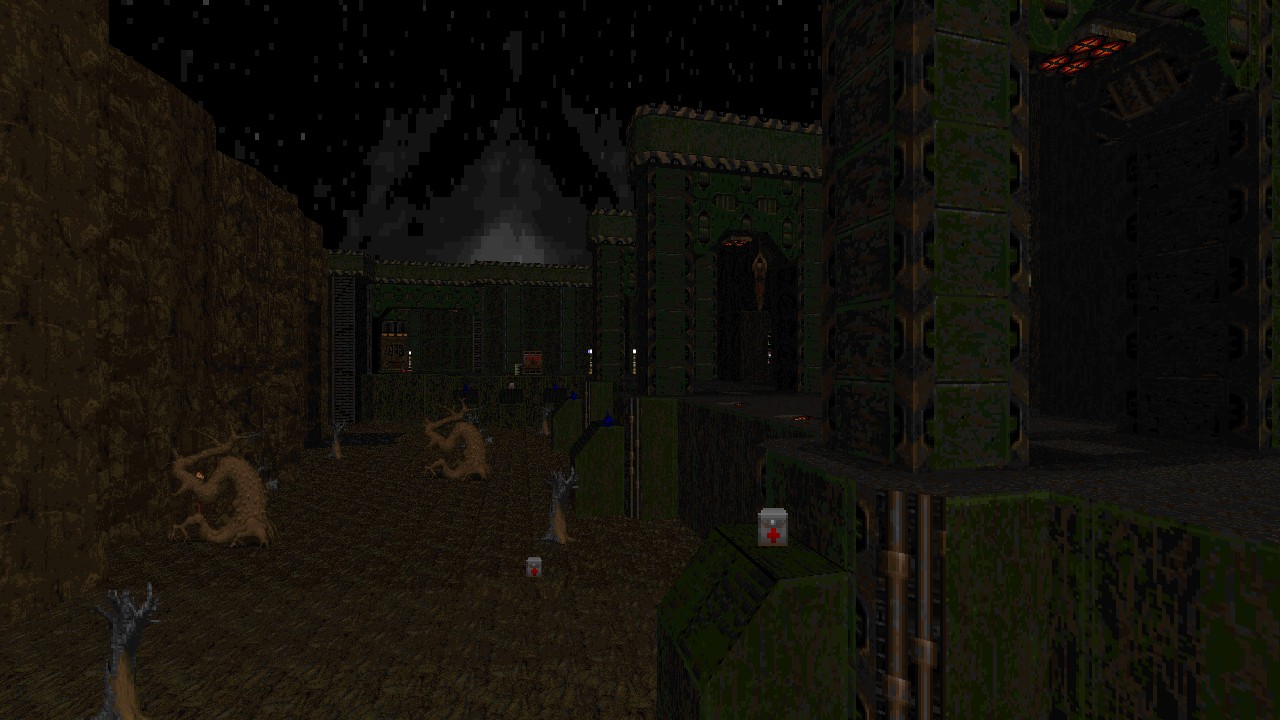
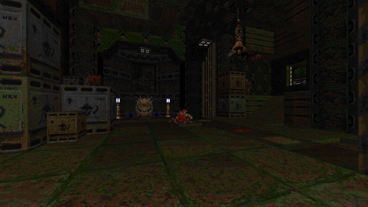
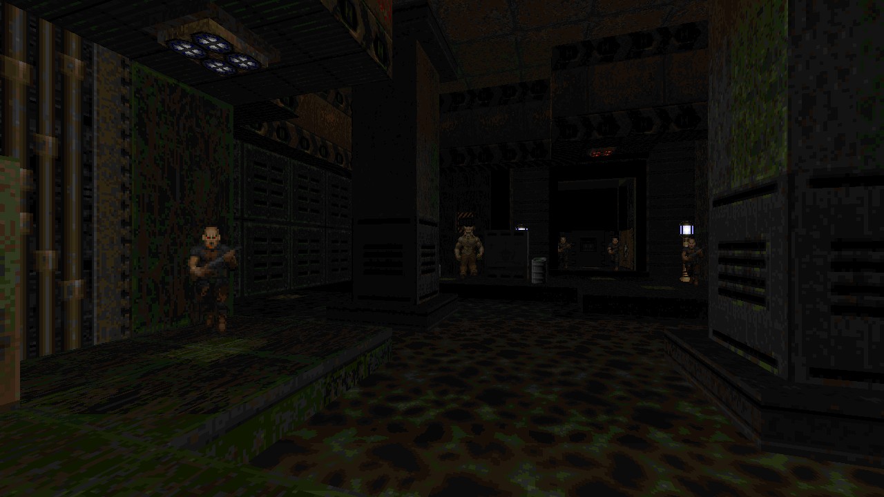
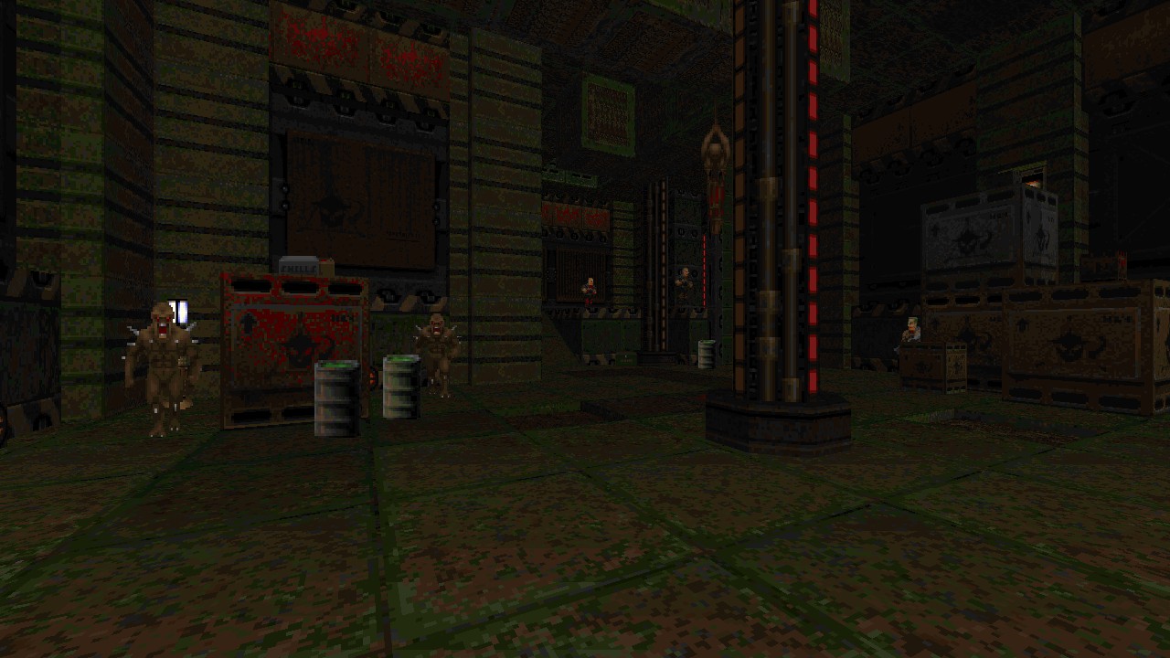
Visual design remains densely structured with moodier lighting gradiants, keeping a consistent and detailed look across three maps without significant changes toward its stylisation, broken up by a few areas that standout usually when peeking outdoors. Few auxiliary colours dotted around can offer some respite from the usual choices, however the sights don’t change a great deal beyond strut heavy hallways and disorganised crates littering them, the latter being common form of filling up spaces. Large portions of the experience feel dry from having too much similarity across the board, where a notable room-corridor-room flow is applied to both navigation and combat. There’s a lack of enemies that simply wander or react to noise, sticking to their static placements while further ambushes are limited to monster closets clashing during return visits. This wasn’t too much of a concern during MAP01 as the initial progression had me chewing through fodder with kinetic flow, having fun discovering secrets and there being a good showcase of interconnectivity branching between one section to another. If only the enemies took advantage of this too. Layout simmers down toward linearity as soon as entering into MAP02 however where paths now lead into their own self contained areas before backtracking to a central hub of sorts. The lack of dynamic shifts during gameplay soon reveal there weren’t enough unique setups for encounters to breathe outside of horizontal shooting galleries, resorting too much to the same hallway skirmishes and lacking height variation contributed to stale scenarios.
Four additional enemies have been added to the roster, their presence introduced piecemeal across the campaign. Zombie Marines aren’t quite as dangerous as their chaingun brethren can be, but still pack a punch up close when using their burstfire rifle, making them a priority target while more or less falling in line amongst the usual fodder. Rocket Zombies on the other hand are glass cannons that launch surprise missiles across long distances. These guys sadly arrive too late into the campaign and are then under utilised even during MAP03, missing their potential as a pocket Cyberdemon causing havoc just without a drawn out fight attached to them.
The Cacolich is an undead variant of a Cacodemon and my favourite of the bunch, their strange appearance and sounds stand out and always enjoy how they crumble apart upon death, like smashing a dried out pumpkin. These creepers often shoot homing fireballs making sharp curves toward your position, sometimes catching me when certain I’d dodged out the way. An alternative attack is their flame breath that drains health within seconds and has surprising reach. Being an undead monstrosity some of them might be too withered and weak, producing nothing more than puffs of bad breath but still remaining harmful at close quarters. Cacoliches are a more common sight out of the four additions and I liked their inclusion within a decaying base setting.
Afrits serve as this unit’s boss encounter, throwing not one but multiple burning hot Baron variants having the ability to hover around and firing off a barrage of heavy fireballs. While not much different to facing off against their brothers, the area itself wasn’t too practical for launching rockets and risk in being cornered was always a high concern. Making use of what little space is available can cause these guys to feel tougher than they really are. Had ZAERO continued, I’m curious if there were plans to make them a common brute going forward or be limited as an episode finale.
Although having extra enemies you must adapt to helped maintain an interest in pushing forward, repetition becomes a consistent sore spot. There’s too much reliance on similar texture schemes and monotone lighting without much shift from an established formula, while environments are often too flat for dynamic combat. Where QUAKE2 could benefit from using coloured lighting and three dimensional verticality to avoid some of these problems, ZAERO could still have embraced other aspects to achieve similar results. Set sections of the base apart using higher contrast lighting and at least make use of some striking colour choice outside the neutral tones could have gone a lone way to break up the design. When these aspects do change from time to time, it works out for memorable locales. Significant height changes to the layout to impact exploration and combat would add spice, opening up how areas connect and allow enemies to move between spaces, especially for both Caco types flying freely. The central area in MAP02 was a step in the right direction, an open space with sight lines looking across a sludge pool into a later areas, but there wasn’t much reason to be down there and hardly any threats when you otherwise do take a dip.
Going back to an older release, especially one designed for ZDOOM, while reading through the included text file with minimal details points my attention to another grievance of mine. Due to a lack of information provided I’m never sure if mouselook, jumping or crouching were required during exploration. All of these are simple fundamentals on their own for controlling QUAKE2, so in the case of ZAERO I’m having to proceed blind until something cropped up where one of these non-vanilla DOOM features is necessary. Using mouselook is a definite requirement for shooting secret buttons that are hidden up high, where I found no nearby terrain that parallels them to fire from. Meanwhile, tiny crate stairways hint that jumping isn’t necessary. I also wasn’t certain whether or not pistol starting each level was possible, only to find out the hard way it’s not balanced for this play style, choosing to retry the campaign after one laborious run to keep my weapon progression intact to see how that faired. Without retaining your firearm acquisitions, combat pacing becomes a grinding slog stuck shotgunning the majority of foes where a chaingun and rocket launcher are absolutely desired. I do not recommend pistol starting any sequential level during this unit, the experience is much smoother for continuous gameplay treating the three levels as a single whole.
Conclusion
I enjoyed ZAERO for what it offers, a functional QUAKE2 like experience while retaining DOOM’s core gameplay along with some nice usage of ZDOOM features. Levels are consistently designed albeit a little repetitive looking, while combat and progression needed more spice besides new enemies and special effects. A small part of the equation for the problems I faced might be because Searle had another three wads planned, at least according to the text file, where we might have seen other environments, different texture schemes and the new enemies put to additional use. What exists is functional as is and doesn’t overstay its welcome for too long. As a standalone release, had they known at the time it wouldn’t receive follow ups, the concept could be tightened up by consolidating the best parts into a single level or alternatively further lean into its usage of ZDOOM features and QUAKE2 inspirations to create gameplay scenarios outside the comfort of basic button and keycard hunting, disguising its later linearity by making your actions feel involved by solving a problem here and something reacting over there.
Download Mirrors
This is a re-review. The old review has been archived here.
