Introduction
The world is full of monsters and you are working for the company who exterminates their kind, Monster Hunter Ltd. Your current assignment is to bring back a stolen, valuable painting. Following its trace leads to an industrial complex where you begin the search.
Review
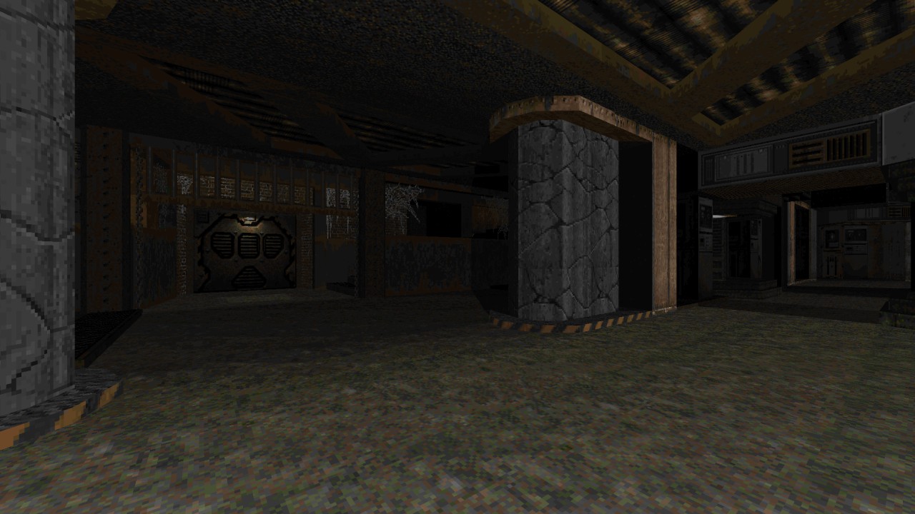
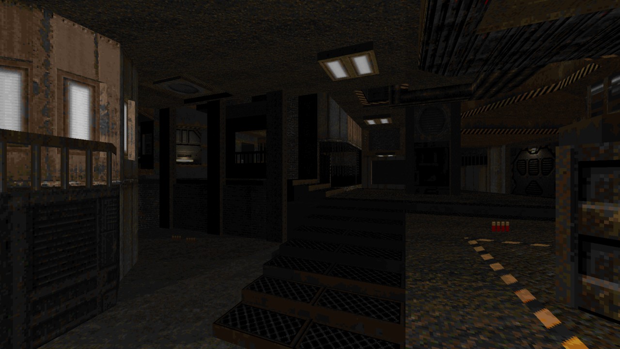
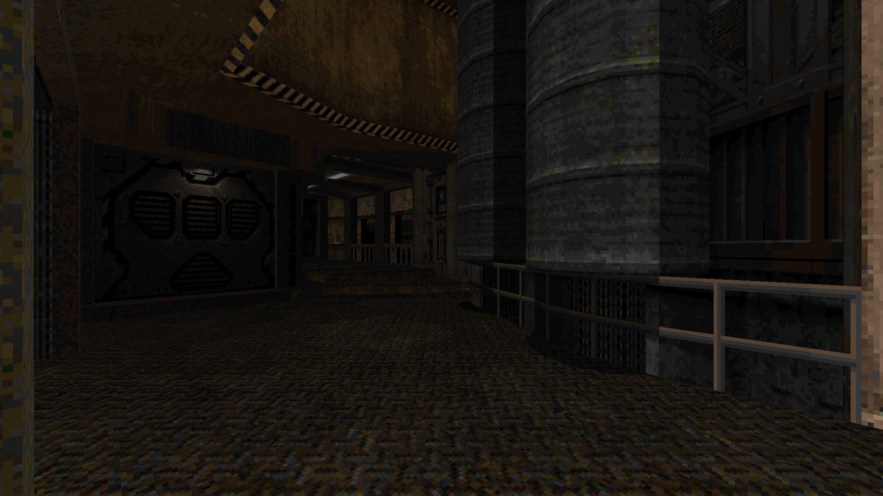
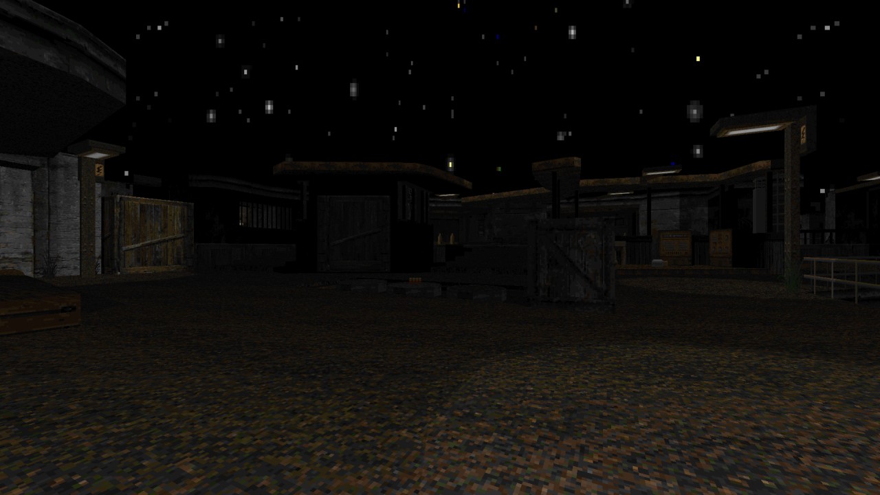
Originally intended as this single giant sized level, Monster Hunter Ltd. was forced to split up into two separate releases due to certain limitations preventing this from happening. The second map was released only a month later. MOHU1 in a nutshell is an incredibly atmospheric journey taking place almost entirely within an old, dark industrial complex. Without any doubts Didy plays well to the strengths of his mapping by going for an abundance of varied shapes, angles and suitable decoratives. Design very much integrates itself into the layout across every location, creating these big self contained playgrounds which twist, turn and contain lots of height variation to get lost in. Figuratively speaking of course. Don’t expect to be stuck running around inside the whole time though, there are some open outdoor segments complete with numerous inaccessible areas beyond the playable boundaries, effectively creating a vast environment. What then ties together the macabre tone is the dark ambient lighting accompanied with many custom textures from sources all over to make up its industrial palette. While true there is a difference in texture styles, they compliment the design well and feel right at home without becoming an eyesore. MOHU1 manages to attain an abstract twist to its layout design while ironically creating a degree of visual realism.
There is nothing too out of the ordinary concerning gameplay outside of combat, sticking to the usual switches and keys formula. Progression through the level is paced in such a way that locked doors will be discovered first before players are forced to seek the key while switches fill in the blanks. There were little problems flowing from one place to the next up until an outdoor section holding the red key. There was a necessary switch somewhere outside in order to open up a path to retrieve it and was unable to locate its whereabouts for quite some time because it almost appears to blend into the surroundings quite easily. This might not be the case for everyone though. Speaking of getting stuck this happened in a literal sense when tackling the saw blade room. In the middle of fighting I accidentally strafed right underneath a crusher and got caught. After surviving the bone shattering experience I found myself wedged into place since the mechanism is set to stop after some time and then couldn’t free myself even when the floor lowered.
MOHU1’s combat matches the overall mood depicted here by steadily increasing the action as time goes on with larger numbers. Fights will mostly be pitted against the various fodder tier with zombiemen, sergeants and imps dotted around an area. Any brute tougher than those such as Hellknights or Revenants seem to be utilised as mere distractions for the weaker foes to catch players off guard. They don’t become much of a threat until the red key becomes accessible as more of them will appear on the scene. This is where the layout design has a considerable influence in the way action flows. Players will need to be aware of their surroundings for enemies will be lurking in all sorts of niches and at differing heights. They can then in turn counter this by weaving in and out through the interconnected spaces to choose which groups take priority over others. I wouldn’t say MOHU1 is difficult in any fashion often providing a plentiful surplus of ammo and health. Its not until reaching the final area holding our main objective do things feel more tense with every beast attempting to force back players with rockets, plasma, napalm and fireballs swarming the entrance. Even an Archvile despite his position can be a little worrisome when low on health in here.
Conclusion
MOHU1 then close its curtains upon entering an urban setting, as if teasing players where to expect the sequel to take place in right before our hero gets some much deserved rest. Though I’m not quite sure why a group of custom dog enemies got tossed right near the end to never be seen again beyond this point, but at least there’s a gorgeous view of town to walk away with. This first part of Monster Hunter Ltd. creates an effective dark industrial ambience while creating an interconnected sense of flow during various combat encounters.


