Introduction
Check your ammo and get prepared, because some nasties are lurking about on board this Rubicon textured vessel, and they’re not very happy about unwelcome visitors kicking through their… uh… docking stations? Grunt and Enforcer infested space vessel themed level with a few other surprises and plenty of interconnectivity.
Review
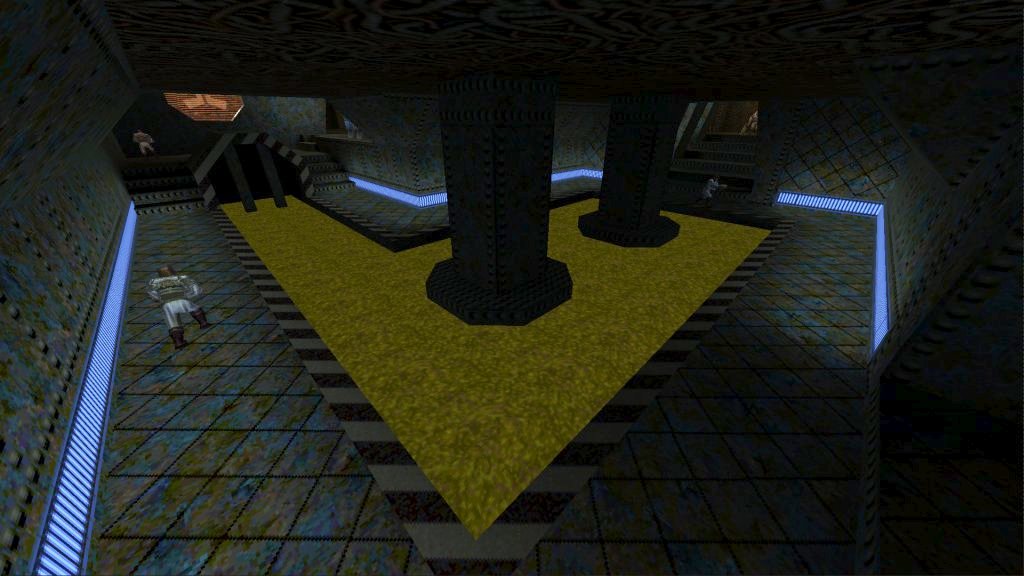
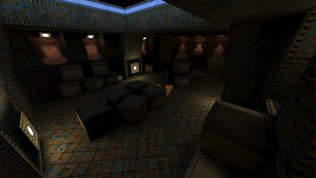
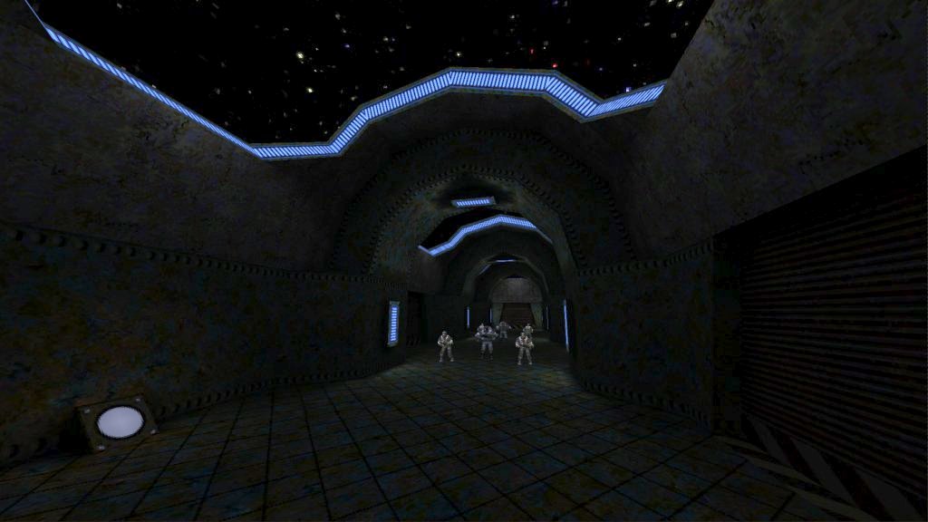
Taking place on board a space vessel, Forwards Compatible is a non-linear romp through the innards of a rustic, Rubicon textured level offering a larger number of routes to choose from, leading from one area to the next with plenty of interconnectivity. Enemy choice is limited to varying amounts of Grunts and Enforcers roaming the halls or hiding away in the upper walkways, and depending on the chosen path, players can also find themselves flanking enemies. But combat remains fairly simple to achieve with little tension, besides for one particular ambush, while plenty of supplies sit waiting inside storage rooms scattered across the ship. Among the regular bunch of foes is a new melee grunt, swinging around his laser sword Death Knight style, desperately hoping to snag the player before being downed. Would have been nice to see these used a little more often with others’ raining hell down upon you.
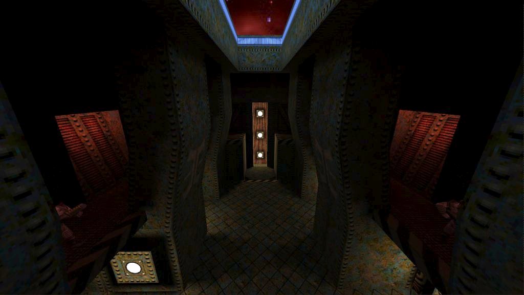
Each location across the ship varies greatly in design through differences in geometry and lighting, or creating something that fits with the room theme, allowing them to appear distinctive and tell areas apart from one another. Coloured lighting is used adding extra flavour to the dominance of brown in the texture set, with turquoise presenting coldness, murky yellow in some of the rooms containing liquids and attentive reds found in the upper segments. There were a few issues I had though, concerning how dark many locations were to the point that doors can be potentially missed. I came across a ship cannon which was hidden away mostly in shadow and it would have been a nice feature to show off some more. In the same area was a door I almost missed. One other negative is the lack of exterior geometry and lighting there to create further depth and provide a better sense that you are on board a space vessel.
Conclusion
The non-linear, interconnected layout offers a decent degree of choice and replayability, despite leaning on the easy side being dominant with weak Grunts and Enforcers. Each area is varied appropriately offering distinctive locations, but does suffer from too much darkness across the level.


Yank up your brightness settings man! On my standard settings the map was quite bright. I downloaded the map only to notice that I already had it in my Quake folder and had actually played it before. Some of those transparent walls didn’t work (like the one in the first shot; it’s just opaque light blue) but other than that it’s a lovely map.