Introduction
The sequel to the original Rubicon released in ’98, which has apparently been one of the longest projects in development for Quake and awaited for patiently by many, and has now been finally released to everyone in 2011. Rubicon 2 is a three level mod which includes a start map, new enemies, features and hazards.
Review
Rubicon 2 begins within a start map where you’ll be doing the usual stuff one would expect, like selecting your choice of difficulty level by pushing one of the buttons at the control panel; locating that shy nightmare skill that could be hiding somewhere nearby; and jumping onto a slipgate to load up one of the three rustic, industrial base levels. Oh and a nice homage toward the Slipgate Complex (E1M1) too. This map works as a good introduction for what to expect in terms of the level design and general mood, including a small tutorial explaining how the new ladder feature works which allows for some control over how far you ascend or drop down. This sequel has a fair number of other new features and hazards waiting for you, but to make things a little easier for you, a help screen has been provided in the main menu which details these additions and how they work.
There are also three new enemy types that are included to fit within the base theme while adding more variety to the existing set when compared to the previous instalment. The Dreadnaught is a decent foe to be wary of, his flamethrower can be deadly and being lit up isn’t a preferable idea. Unless you like your flesh extra crispy. Fighting them is fair play and adds an enemy amongst the base set to be feared when seen. Damage inflicted isn’t too bad, even when on fire which can be doused by water or health pack. Their model can also be misleading in a way, almost appearing to be Enforcers despite enough evidence to realise they’re not. The Centurion is an opponent that hovers in the air, trying to get the height advantage while bombarding you with a barrage of nails. It’s a good addition to have an enemy that is similar to the Scrag for the base set, but he doesn’t take enough advantage of the space they can use, usually sticking to a small area. The reward for their death is only 5 nails too, but considering how plentiful ammo is throughout the three levels, this isn’t too bothersome. Finally we have the Automaton, nicknamed Floyd, who is quite a humorous enemy which looks like a giant tin can with legs and a triple laser attack. It moves slowly, but has tough armour and works as a nuisance while you’re too focused on other enemies, even exploding upon death.
Hydroexploitation Plant by John ‘metlslime’ Fitzgibbons
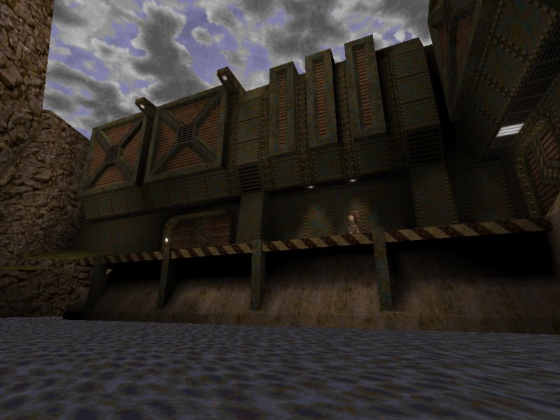
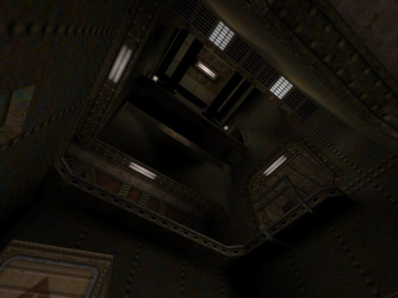
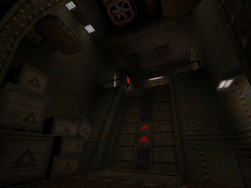
Once you start the map, you should notice another homage toward E1M1 with an almost identical room, only designed within the theme and style the mod is going for. From here you’ll make your way toward the main complex while wading through water in a similar manner to that from the first Rubicon. The biggest difference of course is the improvement with the design, not only from the better brushwork but the texturing actually compliments the visuals that much more and feels less slapped on. Detail is everywhere from the objects to ambient sounds to help make the place feel that much more real and living. There is plenty of shape and attention to things that a base would likely have from pipework, computers and some mechanics. Of course there is a touch of crate syndrome as well. While exploring the innards of the base, some of the ambient sounds can be rather creepy in a way, but works as a result considering this is a place far from home much like the original levels. Good diversity in areas to break up the theme with the addition of outdoor sections with natural terrain, flowing water and some grass to contrast against all the metal and concrete. Even a nice looking dam looms over you as you swim out into the area. Height is a factor the plays out with the level towering many floors you can explore, giving the map a complicated layout with a lot of interconnectivity. There is a nice flow as you breeze from area to area, finding a key or deactivating a laser field. Even the action side of gameplay is simple with many small fights and slow paced scenarios with little challenge to be had. It’s mostly a comfortable journey from start to finish and nothing wrong with that for the first level.
Subterranean Spookworks by John ‘metlslime’ Fitzgibbons
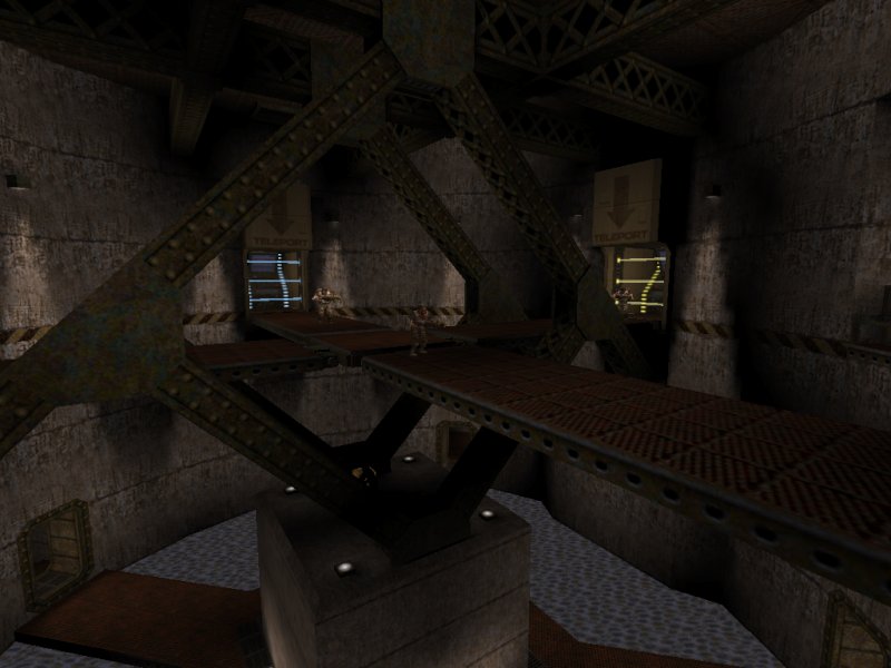
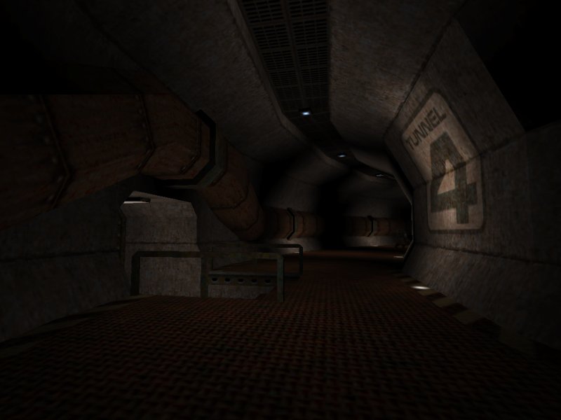
Second map focuses on a central hub approach to gameplay, with three slipgates locked down by their own coloured laser barriers and the switches to deactivate these need to be located in order to proceed ahead. The design this time round goes for a damp, waterworks theme while taking on a more simplistic outlook to visuals while adding in the familiar style later on. Construction is minimalistic with clean curves, working best in the outer corridor with large pipes along the wall, just outside the main room. Scale is generally larger too with more open spaces, but somehow manages to provide just enough details even though it uses less rustic textures and leans more toward concrete. Brushwork is solid once again, following similar traits for details as in the previous map while adding some variety considering the choice of location. We even get another look at the steam valves but by this point I had started to feel that they were too underplayed, being right next to the hazard. Of course I was proven wrong in the level, because shortly afterwards you need to follow the second pipe toward the source and another valve used as a clever reward once discovered in a secret area. The problem here however is that this is the last time you see this feature when it starts to get a little more creative, possibly wasting a good opportunity for a small puzzle based around it. Turrets make their debut here and can be tricky to avoid, while trying to desperately shut them off. They’re deadly to approach and their lasers will push you back, but I quite liked them as a neat obstacle, especially once you learn the trick to get on top of them. Action is pretty much similar as before with several small brawls, while seemingly a little tougher this time round and more foes spawning into the map as you progress, but a good enough balance to keep on your toes.
A Thousand Years Into The Past by Christian ‘czg’ Grawert

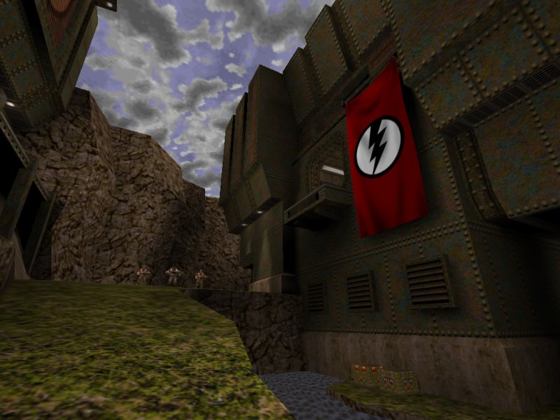
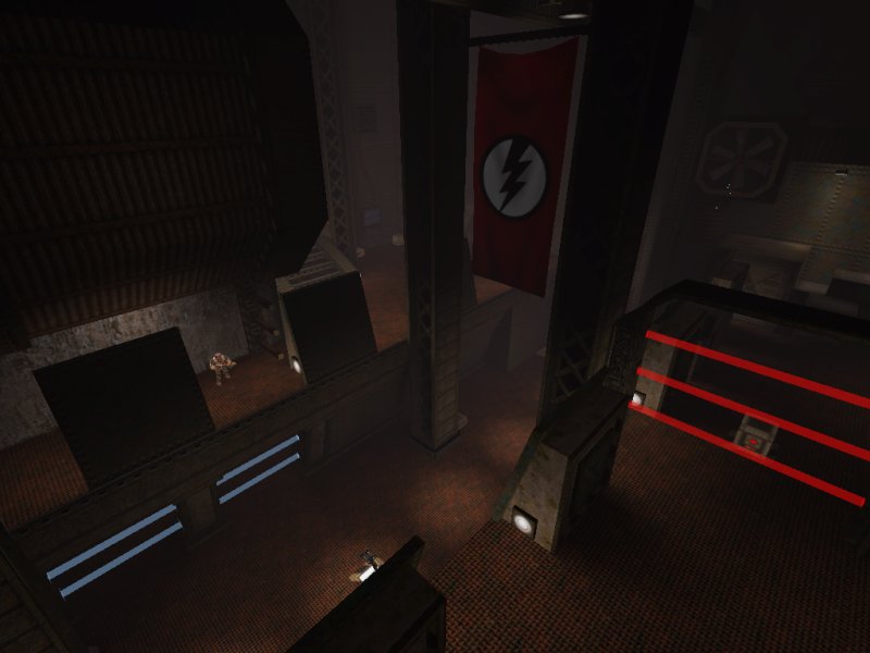
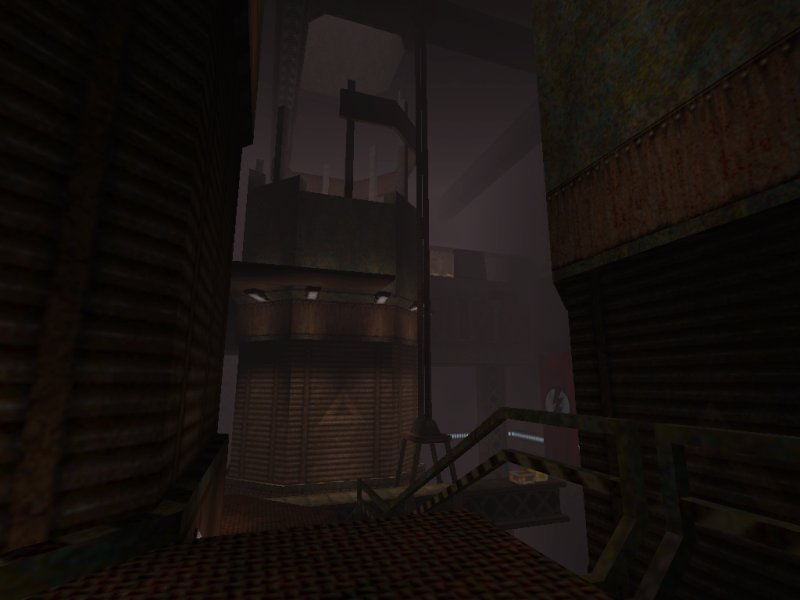
It was upon stepping into the outdoors I knew right away this one was going to stand out in its own way, going for a different feel in terms of mood by the grand scale and atmospheric usage of fog. The design makes use of the texture set with a refreshing change of variety to add that little bit more variation to the mod. The enormous underground location has a rather foreboding tone to it as you stare into the stretching distance and deep chasms below. It almost feels like something more is out there. An effective use of the fog and scale along with the fluttering flags helps to achieve a good overall scene. Visuals remain high quality, much like the rest of the pack except the mapper takes his own spin on the theme while remaining consistent. Not only does the map feel distinctive but still feels part of the set amongst the others nicely. Height variation will play a big part in this map too through design and progression, as you will constantly be moving up lifts and dropping to lower points to locate keys and switches. Gameplay is much tougher this time round, ambushing the player often with higher enemy counts and causing you to fall back more the usual. Dreadnaughts are especially dangerous here because of the high chance in fall off an edge and into the void below, despite there being more open space to move about in. Centurions actually take advantage of this hazard, flying over the chasms to prevent you getting too close and adding some challenge when put up against one on small platform. There was an overuse of Floyds however, which soon became tiresome to fight with, but a good deal of other enemies too and plenty of supplies around.
Conclusion
The three level pack offers some quality entertainment and great looking visuals all round, coming across as more consistent, detailed and lively than the first instalment in the series. Each map has a feel of its own despite the similar theme and provides new features and enemies fairly well to create a fresh experience.
Download Mirrors
Part of a Series
| Rubicon | Rubicon 2 |
